Pete - I moved over to http://petepanda.com/
Friday, April 12, 2019
Copper Charts
Some copper charts and graphs. Mainly historical ones.
A hot one on copper M&A
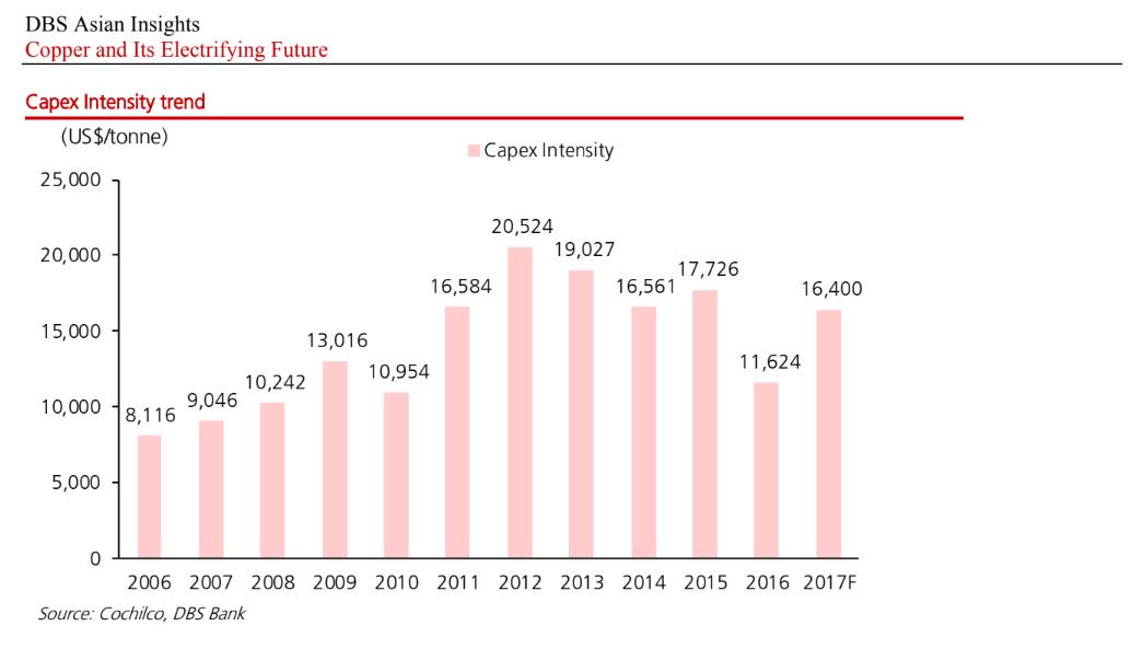
CAPEX per planned yearly capacity
Copper grades declining
OPEX evolution
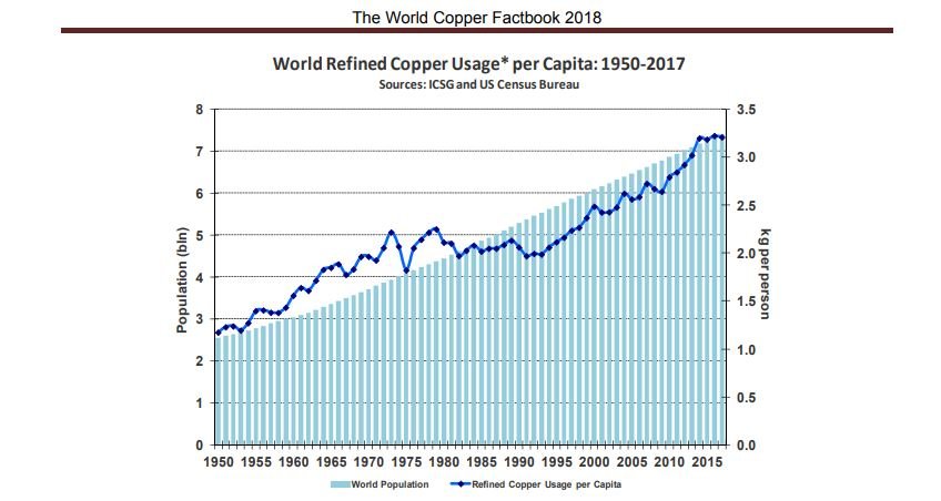
Usage growing in sync with population
GDP. The implication: if India follows China's pathway, it's copper consumption will rise dramatically
LT Copper Chart
Add caption
Copper Production
No comments:
Post a Comment
Newer Post
Older Post
Home
Subscribe to:
Post Comments (Atom)


No comments:
Post a Comment